Saturday 28 August 2010

I'm a massive nerd.

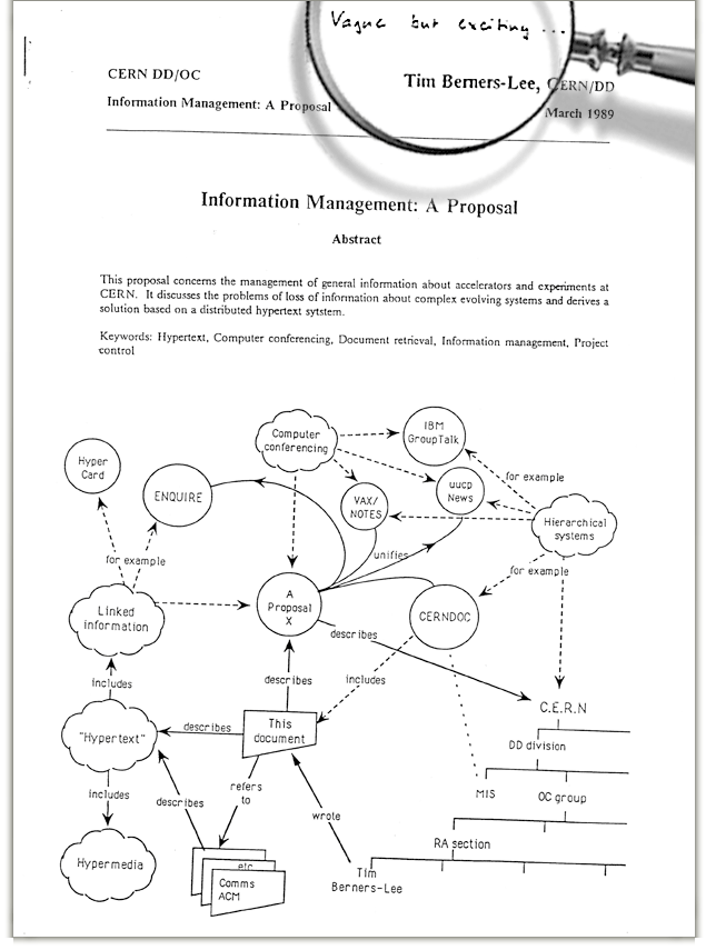
Whilst working at CERN in March 1989, Tim Berners-Lee submitted a proposal for an information management system to his boss, Mike Sendall. ‘Vague, but exciting’, were the words that Sendall wrote on the proposal. Bet he keeps a bit of a low profile these days huh....

This manuscript turned out to be the foundation on which the concept of the World Wide Web was built. The biggest innovation of our civilisation. See the front page of the report below:

Intial proposal
Here is the computamatron that Berners-Lee used to write it.


If you're a bit of a mental just like me, you might enjoy reading the full transcript here

NEEEEEERRRRRRRRRRRDDDDDDDD!

Friday 27 August 2010

Hi

I've wanted this book for ages. I don't want to buy it as I think it would make for a nice present. For me. I'll act all surprised and EVERYTHING.

Saturday 21 August 2010

The colour and the shape

No. Not THAT album, although I maintain its a good one.

This post is about the work of David Watkins. A man I first learnt about during my formative years. A-Level art/late 90's (eeeeek) to be precise.

I LOVE LOVE LOVE his work. The organic fluidity of the shapes, set up against the rigid materials he often uses. And then there's the colour - jewel-strong, striking azures and rubies combined with straight gold/silver or a monochrome "palette". The shapes in particular share a theme that warrants proximity to the body - often moulded around limbs and muscles, drawing the eye to them.

At a formative moment in the 1960s Watkins had worked on special effects for Stanley Kubrick's masterpiece, the film 2001, designing and creating model spacecraft - I don't know if being aware of this draws a firmer association between the influence of the film's aesthetics on the minimalism of his design, or the other way around....

A jeweller/artist since the early 70's, his pieces, to me, have omnipresent relevance & appeal. You cannot define them by a decade.


Hinged Shoulderpiece (blue) Neckpiece, 1973
Large Pendant Bodypiece, 1975
Mt.Hagen Hoopla Neckpiece, 1981
Matrix IV Neckpiece, 1987. Deutsches Goldschmiedehaus Hanau
Four-way Ceremonial Neckpiece (for the Jubilee of Queen Elizabeth II), 1977
Hinged Loop Neckpiece (radiating blue) Neckpiece, 1974
Torus 300: Blue Burst Neckpiece, 2006
Curved Shoulderpiece, 1975

Collections include The Victoria and Albert Museum, London, The Musée des Arts Decoratifs, Paris, The Museum of Modern Art, Tokyo, and The Metropolitan Museum of Art, New York.

Bronwen Sleigh

The reason I don't visit galleries anymore is quite ridiculous.

My only regret in life is that I didn't pursue my total, life-encompassing passion - and without sounding like an absolute tool, natural talent - for art and design. I'm a dick. I can't bear to see the work peers are now producing, knowing that this is their JOB. Had I had the courage to try and fail, at the very least, I could have satisfied my constant urge to create. Instead I languish in a pit of indecision & under-achievement of which is my own making. I bought the spade.

ANYWAY. Less of that. More of this. I came across Bronwen Sleigh's work on a recent trip to the V&A. Her work is a new acquisition, and more than merits the square-inch'age there. Check.

baker_street.jpg
bsl00002%5B1%5D.jpeg
105951.jpg


As described on the V&A site:

"Sleigh is a gifted and innovative printmaker working with a traditional medium - etching - but introducing distinctive painterly qualities through her application of colour, and the character of the mark-making. Her prints show us ordinary unremarkable spaces and prosaic industrial or urban architecture from vertiginous new perspectives; the etchings are arrived at through a process of exploration in two and three dimensions.

She has written eloquently of her working methods, describing how she 'translate[s] places by folding, twisting and abstracting them'. She begins by taking photographs of her chosen location, and these photographs, with their different angles and emphases, guide her in making architectural models which are inspired by the original space but are not literal transcriptions of it. Sleigh then draws from these models, and the imagery evolves again. The architectural motifs are anchored by a mesh of radiating lines characteristic of a diagram or a technical drawing, but the dispassionate precision this might suggest is contradicted by the way in which she makes a positive virtue of the accidental scratches, random marks and scuffs which accumulate through the handling and working of the steel plate."


Winner of the V&A Prize at the Northern Print Biennale.
Back to Back

Ann Sofie Back's new collection for the secondary line "Back".

I do dig.


Thursday 19 August 2010

Oh Karin

I love you. There's nothing else to say.


Monday 16 August 2010

Eastbound and totally down with this.

Nice work K-Swiss.

kenny-powers-k-swiss-1.jpg

Oh, and then there was this which I could not resist. Not part of the marketing campaign I'm hoping.

tumblr_krxfg0fMlf1qzvqipo1_500.jpg

The C-bomb

Its gonna get us all.

Never has the equal beauty & cruelty of nature been so explicit to me.

Breast%20Cancer%20Cell%20Micrograph.jpg

t-lymph-dk2.jpg

Macrophage_Attack_01.jpg

Cancer-Cells.jpg

breast-cancer-cell.jpg

Sunday 8 August 2010

Oh mamaaaaaa, I wanna go surfinnnnnn'

Just like Wolf. FauxPav's lil hound.

Loooook!! He's nakedddddd!!!

Paper, scissors...meh

Paper wins every time. I was the kid that used to get all this craft shit at Christmas. Don't get me wrong, love a bit of straw art, but give me a stack of good quality paper, an easel, some brushes, knives and acrylics and I'm set.

However, Jeff Nishinaka makes me sad I didn't dump the GameGear and take the paper thing next-level.

"Paper to me is like a living, breathing thing that has a life of its own. I just try to redirect that energy into something that feels animated and alive".

Truly epic. I might have to dip into the OPF (Outrageous Purchase Fund - no guilt savings pot).
I might have to fight Jackie Chan for one though, as apparently, as well as being a close personal friend, he also owns the largest private collection of his work anywhere in the world. FIIIGHT!!


b041ba6f95de9411485930a8d783667e.jpg

If you want to see how he does it, here's a video he did for Sprint Press to promote their green initiative.

There's no place like home.


West is best.

I know the feeling.

Loving Steven Burke's work.

Poor Little Trees

They originally lived in the South of France but I fear they may have been..*sniff*..turned into bog roll or something equally mundane and useful. Poor little trees...

So what about Steven?

Born in Karlsruhe (Germany) in 1982.
Worked for Takashi Murakami during summer 2003 in New York.
Gradueted from "Visual Communication School" (E.C.V.) in 2004.
Became illustrator at Lezilus in 2004.
Created the art gallery Regala in 2007 with Sébastien Paquereau.
Showed his works at OFR Gallery, Paris in 2008.
Lives and works as visual designer in south west of France.

Has created pieces ranging from sculpture to logotypes, visual identities and illustrations.

To date he's worked with...

Marc Jacobs, April77, Ambiguous, Graniph,
Coca-Cola, la Grande Epicerie de Paris,
Condat, Karl, Santosha, Minimi, T-post...

Here's the M by M work

Marc Jacobs

I love the graphic playfulness of it all. Childlike but really engaging and emotive.

Alphabet

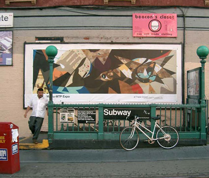
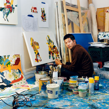
Tomokazu Matsuyama/MATSU-MTP

The beauty of it all...

Read more about him here

tomokazu5.jpg
tomokazu2.jpg
Tomokazu-Matsuyama-LeSportSac-1.JPG
20070613_168173.jpg


He's also responsible for Room 401 at the Hotel des Arts, SF.